Primary Play: The Bold New Mood Transforming the American Home in 2025
Every January, Pinterest drops its list of design predictions, and most years, you can see them coming—muted palettes, calming textures, minimalist lines. But for 2025? The forecast is anything but predictable. Enter Primary Play, a bold, unapologetic, and slightly mischievous movement that’s turning the American home into a playground for the senses.
Don’t mistake it for a literal playroom makeover. This is a sophisticated reimagining of adult spaces, where color, form, and texture aren’t background details—they’re the main act. It’s an aesthetic that channels Bauhaus optimism, the rebellious spirit of the Memphis movement, and the tactile indulgence of contemporary design, creating interiors that don’t just sit quietly—they start conversations.
It’s not hard to see why the pendulum is swinging. After a decade of beige sofas, greige walls, and “quiet luxury” minimalism, homeowners are craving something louder, livelier, more them. The pandemic years, when our living rooms doubled as offices and our kitchens became everything from Zoom backdrops to makeshift classrooms, left many of us ready to rewrite the script. We want spaces that energize and inspire us, not just soothe us into a Sunday nap. Primary Play delivers that with confidence—and just enough drama to make you smile every time you walk in the door.
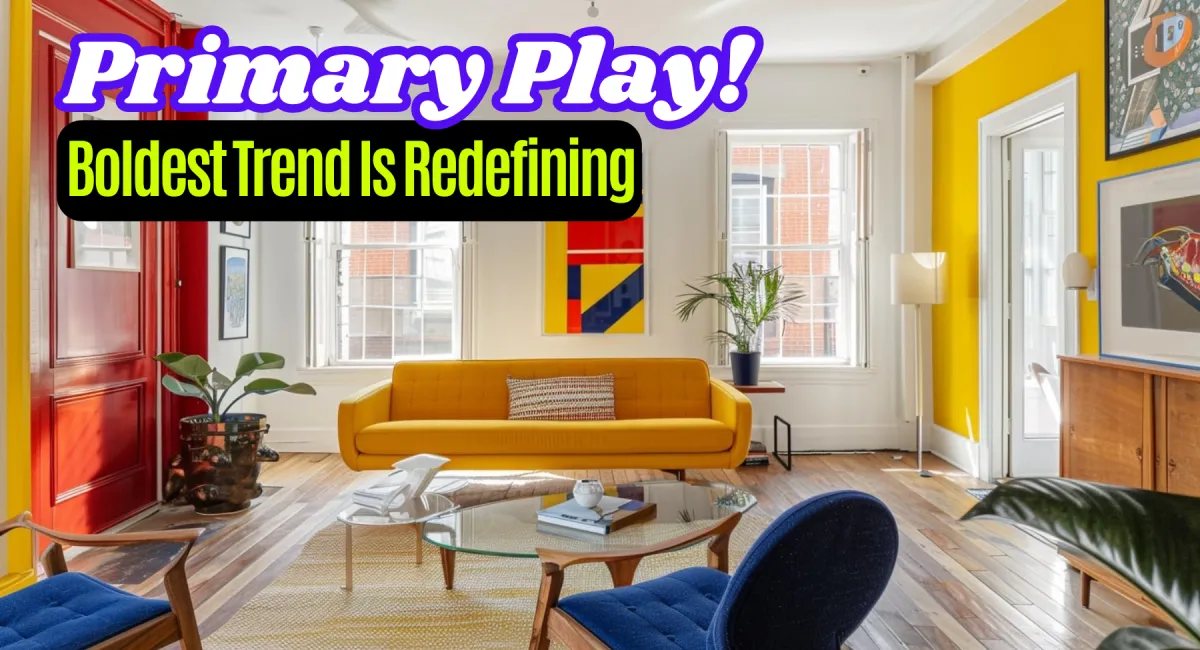
Picture saturated reds, electric blues, and sunlit yellows—not as timid accents, but as unapologetic blocks of personality. These hues play against furniture with unexpected curves, tables with edges that feel hand-sketched, and lighting that doubles as sculpture. The tactile experience is equally important: plush velvets, glossy lacquers, high-shine ceramics, and rugs so textured you’ll want to walk barefoot just to feel them. And while it’s playful, it’s never impractical—every piece is chosen for living, not just looking.
Design psychologists have long known what Pinterest is now packaging into trend gold: environments rich in color and form can actually shift your mood. Warm, saturated tones spark energy and motivation. Irregular shapes encourage creative thinking. And homes that surprise you—even in small ways—become places you truly want to spend time. This isn’t just style; it’s emotional architecture.
So how do you bring it in without going full Willy Wonka? Designers recommend picking one dominant primary color—maybe a Klein blue sofa or a sunshine yellow dining set—and letting the others sneak in through art, accessories, or a single standout wall. Balance the boldness with natural textures like pale oak, raw linen, or Carrara marble to keep the room grounded. And invest in one statement piece—a chair that feels like sculpture, a lamp that looks like it belongs in a gallery—that acts as your trend anchor.
The magic happens in the details. A Bauhaus-inspired living room with a modular blue sofa, lacquer-red side tables, and a golden ochre accent wall feels equally suited for cocktails with friends or a quiet solo evening. A home office with a curving white desk, yellow velvet chair, and floating red shelves might just make Monday mornings something to look forward to. Even the kitchen can play along: a deep blue island, canary yellow bar stools, and Memphis-style pendant lights that add instant conversation starters.
But maybe the most important shift Primary Play represents is philosophical. It reminds us that joy, surprise, and playfulness don’t have an expiration date. In today’s American home—part office, part café, part sanctuary—design isn’t just about how it looks, but how it makes us feel. And when that feeling is a little braver, a little happier, and a lot more creative, the design has done its job.
It’s not for the faint of heart, but then again, neither is living boldly. And that’s exactly the point.
